Monday 21 May 2012

Self Evaluation

Evaluation of Role in the Group  

For the 'Fashion and Constructed' project, my role within the group was hair-makeup and costume plus camera. I was given theses roles as I felt comfortable and was willing to learn about the hassleblad camera, and was confident in styling and wardrobe.

As the project progressed, we all found ourselves contributing with other roles and responsibilities which at the end of the day, as long as we got the job done we where happy to help.

Lighting, I found interesting, as I was keen to learn what lights created what effects. Through workshops and experience I was able to draw lighting plans which I thought best would contribute to our set, creating the write amount of depth, texture and detail.

Props I enjoyed, as my task was to collect leaves from my local woods, chop down or collect logs and stumps, buy soli or bark for our flooring and travel to wicks to buy 2x1 wood for our frame. Although it seems a lot it didn’t feel a lot, I made sure I set targets, for my self to achieve.

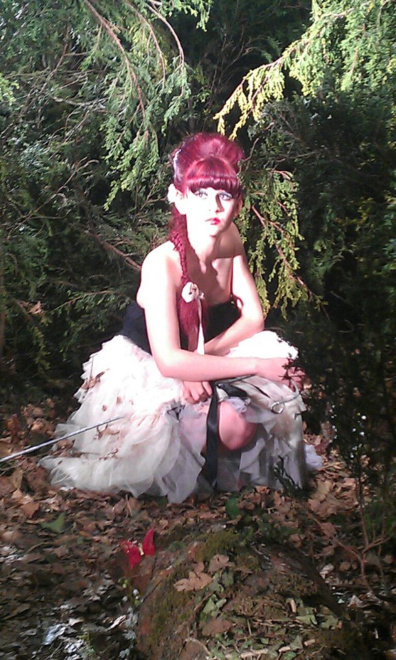
During the course, I also helped with casting. It was mine and Christie’s job to find a model that was suitable for our brief. Before we asked people to model, I built up collages of images that we as a group where looking for. This included cut off magazines, Internet, books etc of the character. Our idea was a girl mid teens/early adult, thin, brunette hair, defined cheekbones etc as this captured a modern and contemporary look of Little Bow Peep. A girl who herself is trying to find her own way in life, someone who oozes confidence but has a sense of vulnerability and uncertainty of what lies ahead. To start this search i began by finding possible candidates through modelling agencies, associates of friends, and also holding casting sessions at uni, unfortunately we didn’t find any suitable models on casting days and model agencies where expensive, but there was hope when asking people we knew, that where interested in this offer.

After interviewing and photographing models, Dana showed us a photo of her friend called Chloe. Having had some modelling experience, Chloe was defiantly interested in this opportunity and was willing to model for our shoot. Before we could say yes we asked if we could meet her and interview / photograph her.  When meeting her we explained our concept, took her measurements and generally started to make a friendship with her. This meeting went well, and still was interested in modelling for us. After analysing her photos, we decided as a group to accept her and luckily for us she was willing to help free of charge except for train fare. To thank her, we gave her a copy of our final image as this would be useful in her portfolio.

I really enjoyed working with Chloe, as I think she captured the essence of the character. The only problem we found difficult was instructing her. Her interaction with the camera looked tensed as I think she was a bit nervous at the begging of the week. Luckily towards the end she relaxed which helped us when capturing the pose.

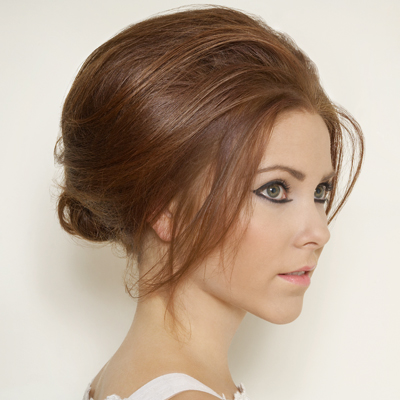
When it came to hair-makeup, I was lucky I knew a professional artist that has previously done films and theatre. I asked if she would be free for that week and she replied with a yes. Before meeting her I previously had done some research in this area of work and had some images that I thought could work best with our narrative and character. I showed her the designs and she practiced over the weeks commencing the shoot. The group and I saw the pictures that she had sent through email and we came to the agreement of liking her style.


Costume was difficult to design; as we had to find an outfit that we though best described our narrative. As our story was set in the regency era we thought of designing an outfit that people wore in this time, but we wanted to incorporate a modern twist allowing some suggestiveness. In lead up for this topic I sketched some drawings which helped chose our final outfit. We brought the outfit form a shop in Rochester high street.

I also helped with poses. I researched several before shoot day, as I wanted to be confident enough to instruct the model. In order to do this I researched the type of character we wanted to create and collected images from websites and magazines. Ideally, we wanted awkward poses and postures as if the 'old' traditional character of Bow Peep was being shredded away to reveal a newer, more modern Bow Peep one who wanted to explore her character and sexuality.

On shoot day we all made sure that health and safety was checked, and the model and stylist were OK, in respect to food and drink and that references we had asked for.

When it came to the editing process, we all had an input within the final image. Although the group and I were not the best Photoshop workers, I felt some areas of the editing could have been better, if we had more time and experience. I think the downfall of this area, was not allowing one member of the team, to attend the editing meeting. Unfortunately I think this was down to our team member. I understand she thought it was best we all stayed and helped de-construct the set, but I think due to lack of experience , one member of the team should of gone. Unfortunately I was unable to attend as my role was driving back and fourth to the tip with trees. I think this was a lesson well learnt and know for future work.

Despite having less experience in the editing process, I felt I had learnt a lot over the last couple of days. I now feel I could edit a lot better with the confidence applied. This whole experience of the week was an eye opener into the real world, and has helped my team skills and interaction with other people. I also have learnt several new techniques in the practical side and have listened, taked note and learnt from others. Overall I feel I know how to work with people’s weaknesses and strengths in a constructive manner, which I think will help in my future work.

Saturday 19 May 2012

evaluation of shoot days....


Day One: Our first day of our fashion constructed image task was based upon building the set. We began by my self and Dana spray painting the typoling flooring and getting the trees up. The group and I also made our frame from the 2x1 wood I got form wicks which held the trees upright a. To keep the trees firm we used green and silver garden wire.
 
What we did: 
-set up the wood.
-Put flats up,
-made grid to hold the trees
-Placed typoling flooring down. 

Problems:
> When building our grid I brought the wrong type of wood, so my self and Laura had to take the wood back and rebuy wood that was thin enough thickness wise, which unfortunately added more to the budget and time.
>Due to heath and safety problems, we found it difficult to reach the top of the trees, so we had to deal with the small step ladders which proved difficult sometimes.
>We also found it difficult to hold the trees down at the root. To begin with we held them up with sandbags, and as we positioned the trees in the right places we then secured them with garden wire.  We then realised soil might be easier to hold the trees in the correct position and would also fit in well with our forest set, so the next morning I drove down to B&Q and brought some soil and started to build banks around the base of the tree taking away the sandbags. 


The image above shows the group and i starting our set build of placing the trees. As you can see, we have positioned the light in the centre of the set, to create a halo effect referencing back to Alexander McQueen fashion 2012. Where i am standing is where our model would be positioned. The light is positioned on a steel pole above the set, and held by two stands that can easily be wound up and down.  This lighting experiment enabled us to see where to put the trees to create a sense of entrapment.


 Adjusting the lighting!
 

A test experiment based upon our lighting choice.We have started to place in the stumps , to create a sense of wood area and the flooring has been sprayed to the colour brown, to create a sence of woodland environment .
 
Day two was about lighting and the positioning of props. 


Here you can see Robyn and Dana adding branches and trees, to make our set look dense and to create that atmasphere of entrapment. Unfortuantly, we ran out of wire so we had to use silver coated wire instead, which meant when editing our image we would have to cut out this feature.  
 
Day Two

What we did: 
Today was based around cutting excess branches, which proved to be difficalt with the health and safety regulations. We also filled up our scene with logs and branches to portray depth. And also placed black foam boards to hide the flats.   

Problems
Ran out of soil, so had to go and buy another bag, which in the end didnt need, so time was wasted on  travelling backward and forward to destinations.

Shows the flats covered by black foam boards.
 
 The image below shows the effect of the foam boards. The set became more black. We also added a trunk to the side of the set, which catches the light, perfect for texture and detail. 

We aslo began to add lights. In the image below, you can identify a flare of light appearing from the side, so we tried to highlight the definition of the trees. We also played around with the diffuser over the light, as this would get rid of this type of lighting, but nothing significant was shown so we slightly re -positioned the camera.


These photo`s show tests of useing the smoke machine. We had this idea that the use of the smoke machine would create a really atmospheric quality, but when we began to test the machine we thought the effect appeared too light and thin, so we would of had to have the machine on for a long time,  which was not possible.


When testing out lighting and positioning i stood in the set, in order to see the effect of the lighting and the height of the trees. In the end, we thought we needed more lighting around the trees to produce more definition and to make them appear more defined.

These photos show us adding more light to the set to give the trees more definition at the sides and needed more at the bottom. 


When observing the image below, we felt we need to highlight the trunk at the left bottom courner, but realised this was too harsh and wasn't really highlighting the trunk, which we tried to cover with hydrated moss to give a realistic feel.  
We then started to use smaller more directional lighting in order to highlight the texture of the trunk. We liked this idea of creating pools of light, so we explored this technique in day three. 


The before and after of the spotlight. We played around with density of the light 

Day Three- Lighting(pre test) 
What we did:  
We laid the leaves i collected for flooring texture and made sure any tweaking had been done and no other branches needed to be added to bulk out the forest set. 

Problems:
It was all about the lighting and the positioning of the lights and the effect and problems it caused with the adding and taking away of lights. In total we had 10 lights.

This shot was after we added the leaves for texture. We thought that the five bags of leaves wouldn't be enough but five was enough. Although I did have to go outside and collect some more. Adding the leaves added another problem as we had to add more lights to highlight the different textures and colours of the leaves in order to make the set look real. Unfortuantly at this time, the set looked flat due to the lighting.


Again, i stood in the set, as we could then test out  positions and lighting for our shoot.
 
To make our set look more appealing to the eye and realistic, we added fake wild flowers at the base of the trunk and in clumps around the set. We thought it gave another dimension to the shot and made the set look more realistic. Here, you can see we are playing around with pools of light. We also tried bulking out the trees on the left with some branches we found, but they were the wrong type of leaves so looked out of place.


Jonathan just tried to move the light to create a more defined circle of light. As a result the forefront of the image is much darker, therefore there is a nicer use of shadow around the model to create a sense of entrapment. 

Day Four and Five: Shoot day!
 
.


Thursday 17 May 2012

editing notes

Unfortuntly due to time, my group and i where unable to attend the meeting about editing and photoshop. Due to this issue i luckily gained some notes for another member in the coarce.


Phocus

-          Major editing such as colour temperature should be done in phocus.
-          Job info
> Destination: [RAW Files Destination]

- ‘Adjust’ tab:
> colour temp can be changed
> colour correction- select colour with eyedropper tool & then change tint on colour wheel.

- Modify:
> Change something about one image
> Select other images which we want to extend our changes to
> Click modify- this will give them the same adjustments.

- Preferences:
> ‘Save Adjustments’ should be set to ‘Always Save’.

Export:
> export as TIFF
 
Naming of Folders:
> Main Folder- [name of project]
> [name]_preview
> [name]_raw
> [name]_tiff

-          When  saving on photoshop- save as PSD or TIFF
-          Check blacks for colour cast.
 
Photoshop

-          Image Size:
> Pixel dimension should never change
> unclick ‘Resample image’
> when changing document size- 110cm width, keep resolution the same
> ‘Save as’ when taking away info.

-          Use Ctrl + space to select ‘actual pixels’ which allows viewing at 100%

-          Dust/scratch removing:
> Create a new layer (make sure to always work on correct layer)- [Dust/Scratches] layer should sit on top of background with nothing in between.
> Spot healing brush Tool (100% hardness)- automatically samples, for even surfaces eg. skies.
> Healing Brush Tool (100% hardness)- (all layers) alt + select area to sample from eg. close to edges & lines.
> Clone stamp tool- use when the other two tools do not work (have ‘sample all layers’ ticked).
> Bracket keys can be used to increase and decrease the zoom.
 
Never use adjustments from top bar always from the layers section on the right.
-          Curves:
> Contrast & colour corrections
> S shape
> Use one curve for one change eg. luminosity, rename and then create another.

-          Masks:
> Select a mask on a layer/curve (if white everything is selected, if black nothing is selected).
> To select areas- use a soft & large brush tool.
> Shortcut to make mask black- command + backspace with the second colour square black or edit> fill> change colour
-          Use back slash key to highlight what has been selected by brush tool
> Alt + click mask to look for any holes in the selection.
 
Selective Colour:
> select a colour using eyedropper, choosing colour from a list & then slide bars to change tone
> use before curves to change eg. skin tone

-          Use arrow button in bottom bar & select document profile
> in photoshop always should be Adobe RGB 1998 file.
> monitors cannot represent all of the colours in colour space
> so do papers therefore colours will look different from screen to paper.

-          View> Proof Setup> Custom> Device to simulate: (set to profile given)- EP4880 imediaT Photo Lustre paper.
-          SP9800 is used to print at a larger scale.
-          Black point compensation & simulate paper colour turned on then turn preview on & off to check colour tone etc.
-          Gamut warning on with Proof Colour on (under View)- this shows any colours that cannot be represented by the monitor & therefore the printer will not be able to produce the colour (only happens with saturated image).
 
File> New> Size: A3
-          Click ‘Advanced’> Adobe RGB 1998

-          Print Corrections:

> flatten layers before doing corrections for printing (save this for digital hand in).

-          For printing:
> Image Size: 300 resolution, resample image, change width to 10cm
> Add a curve- brighter
> Flatten the layers and move over to new canvas which will fit around 12 on.
> Then undo flattening, hide first curve, add new curve to make brighter & repeat flattening and moving.
> Continue doing for 3-5 tests as if doing a test strip.
> Do the same with colour tone- warmer/ cooler etc.
> Also include an unadjusted image on test strip
> ‘Save as’ test strip.
 
Save final image as PSD for Bjorn to print with print adjustment layers included eg. Bright 1 curve
-          We should save final image as [title of project]_final_number.
-          Print test file with lower resolution- decide on print adjustments (name curves ‘Print Adjustments’) from test strip- move onto proof print file & Bjorn’s file.

-          File > Print >
       1.       Printer: Epson left Semi/Gloos
       2.       Photoshop Manage Colours
       3.       Profile: EP4880 imediaT photo lustre
       4.       Print settings >
       5.       Preset: Epson Left imediaT T 265gsm
       6.       Paper Size: Super A3 / B

After we had made this decision we wrote down what needed to be tweaked in Phocus and Photoshop:

> Right hand side (trees) need to be lightened as they are too dark so need more detail
> In some places tone down the flowers too bright
>Top branch needs to be dodged and burned. Too light so becomes a distracting factor. Crop it.
> Correct the colour on the dress. Too dull, needs to be crisper
> Flooring at the front needs to be lightened to create a ring. Also looking a little flat?
> Even out light and dark parts of the shot, to balance out the composition.
> More detail in the overall composition
> Silver wire
> Remove white feather on the floor ( back right)
> Edit out hairbands
> Leg and hand (colour)
> Odd looking shadow/ left hand arm too dark
> Highlight butterfly and flowers
> Dodge and burn hot spots


We adjusted the colour, light and shade in Phocus then did all the tweaking of the small little bits in Photoshop.

Notes we took on about Photoshop

> Dodge: Brighter/ Burn: Darker
> EP4880 photolustre paper
> Contrast, exposure ( bottom: blacks, top: highlights, middle: mid tones) Press default to get rid of completely.
> x key: out with the whites
> Colour correction: tool button to select a particular point to change the colours
- arrow point away from the colour from you to lesson/get rid of
- arrow in (red)
> Sharpness- don't go above 200
> No less than 100% for reviewing print.
> modify button- tick what you like/ want above the points
> Images - Save adjustment- export as a TIFF
> Morid- on the skirt no more than 150%
> To make a background copy
- Square: select
- cmd/C: to copy
- apple/V: create a new layer
- vector mask: selected
- cmd/back arrow
- brush tool: 100%
> Pen tool: use it for to create a path around the left arm- + add some more to the path   - to take away. When going around don't do a single click. drag and then rest and then bend it to go around corners.
- to get rid of a path: click the middle of the path (the square) and then hold down ALT key then click delete path.
> Bubblegum rubber band to do a quick selection
> X ( mask) red  means wrong. Press down CMD to activate the mask
> Transparent layers: do any tweaks on them as they add to the background copy of the image
> Dodge and Burn: duplicate background before doing it. Find spot to duplicate and hover over place that needs tweaking and drop.
> Paths: add a path each time you use the pen. Name it different each time. Save selection then load selection.
> With every layer you add add a suitable name to it such as Right lower arm, in order for you to know what each layer does etc.


Tuesday 15 May 2012

final hair and make-up / day of shoot

The finished look ( minus the lipstick- that was put on at the last minute!) Looking like we wanted. It was suggested that we try more dramatic looking eyelashes, which we did on the Friday, but we found that they were too over powering and you couldn't see the eyes and they became too distracting.


some pics taken off Justines phone from from shoot day....


pictures from shoot day


Pictures from the actual shoot:
On our shoot days the 3rd and 4th May 2012,  we used a makeup artist that i knew, her name was Justine Carter. Until our shoot day the group unfortunately hadn't met her due to her busy schedule, but luckily i was in contact with her regularly through Facebook, and letting her know our thoughts of what the hair and makeup we were wanting to portray. I realised keeping in contact with her was crucial as she could practice the designs before shoot day which helped a lot.


When the group met Justine on shoot day, they mentioned how friendly and professional she was, which made the experience enjoyable and relaxed. Even though we thought the hair and makeup took longer than expected, I think the end result was exactly what we as a group hoped for. 


the above images show our set-up for our shoot day. we made sure the dress was placed on a mannequin so the model and stylist could refer to it as a reference point. We also printed off images to place on the wall, this included hair and make-up. Tables and chair where also laid out, in order for Justine (hair and make-up person) to lay out her equipment. We also made a changing room for the model. We used pollyboards and placed them in the corner of the room,which allowed the model to change freely. 


hair and make-up

below are the images we selected for our final hair and make-up look.

Hair: We wanted something that was simple, fashionable yet linked back to the youthfulness of the character and the depiction of Little Bow Peep. i researched into several fashion shows for ideas, and thought the hair style we liked worked well with our chosen theme. We also wanted to the style to look a little bit messy due to the setting the character finds herself in. Therefore the style we chose was a fish tale plait as we thought it embodied all of the above features.


through research we also liked the beehive look and thought it could work well with our design. We thought instead of using a hat like the imagery of Bow Peep, we would create volume by  heightening the hair. we thought by creating this effect it portrayed a modern contemporary look.


Makeup:
For our make-up we wanted a contemporary look yet vintage style, keeping the old with the new. We wanted our character to represent a innocent girl so we decided not to go for an overpowering style yet a style that accentuated features and catched the glimpse of your eye. 
Research.....
Smoky eyes: Will emphasise the models eyes that are quite dramatic ( but not too dark that the yes get overpowered by the makeup). Will work well with her dynamic face and her bone structure, drawing her as the focal point.
Pink blusher: Not overly pink (that she becomes doll like) but pastel colour that highlights her cheekbones.  
Dark looking lipstick: To create a dramaticedgy look.
> Eyelashes: Dramatic looking ones? 


Above: A sketchbook about makeup/hair and how to achieve these styles...?